Ukrainska 15
View the live projectAn interactive digital story built from my family’s real messages, voice notes, photographs and videos during the Russian occupation of Kupiansk. Ukrainska 15 turns this personal archive into a chronological experience about one house, several generations of one family, and what happens to memory when the physical place that held it is lost.
Active design & development: Dec 2025 – Mar 2026
The short version
Ukrainska 15 is the address of my family home in Kupiansk, Kharkiv region. My great-grandparents built it and lived there, then my granny and mother. For generations, this house was part of our family’s life.
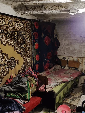
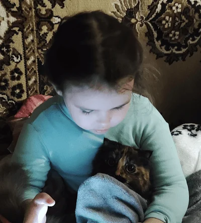
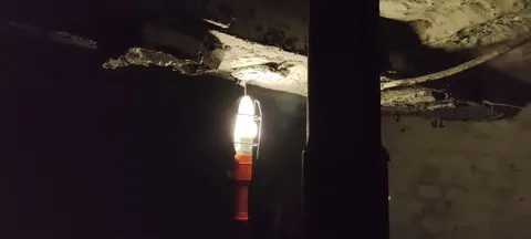
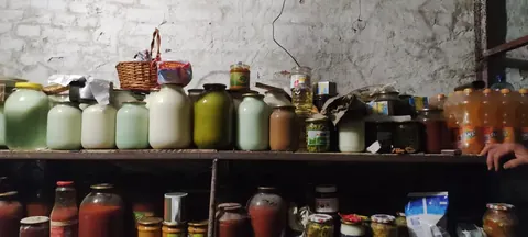
When the full-scale invasion began on 24 February 2022, my family moved into the basement. Carpets went from the floors to the cellar walls. Five adults – the whole family, my daughter and a cat lived there through the first months of the occupation.
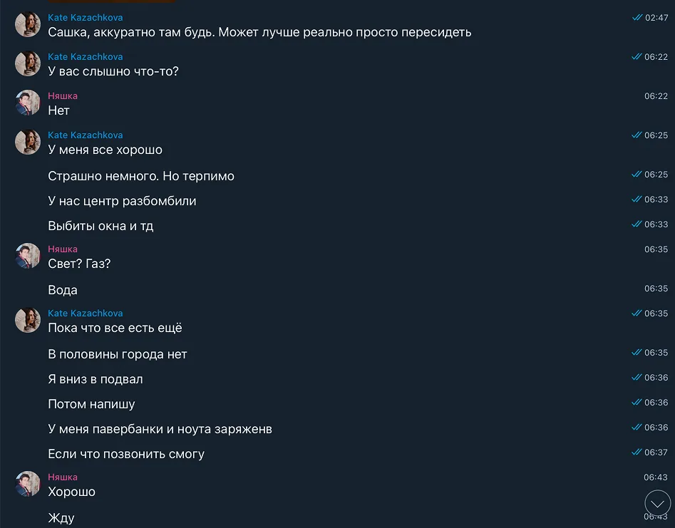
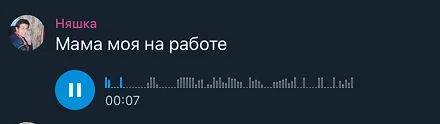
During that time, I kept everything without really meaning to: Telegram messages, voice notes, video circles and photographs. Two years later, I realised I had built an accidental archive of what happened to my family and our home.
But this project was also about letting go.
The house connected several generations of my family, and losing it made me think about what we carry from one generation to the next – memories, displacement, fear, trauma.
I couldn’t bring the house back. But I could preserve what was left: the messages, voices, photographs and memories. Ukrainska 15 became my way of giving them a place to live – and of finally letting the physical place go.
I didn’t want to build a memorial page. I wanted someone who had never met us to enter the story, understand what happened, and stay with it until the end.
Turning a personal archive into an experience
Once I decided to make the project, I wasn’t designing only for myself anymore. To my family because we had lived through them. To everyone else, they were just fragments.
But the challenge was to turn this private archive into a story a stranger could follow – without turning it into a news article, a historical timeline or a memorial.
The original material had to stay at the centre. The interface had one job: give it enough context to be understood without adding more weight to an already difficult story.
An archive that was never meant to be read
There was no research phase in the usual sense. The material was already in my phone.
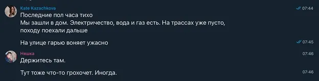
And of course, none of it was made for an audience. The messages were fragmented, repetitive and sometimes deeply personal. A few words could mean everything to us and almost nothing to someone outside the family.
I started by putting everything in chronological order and adding only the context a stranger would need to follow the story.
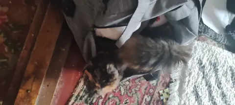
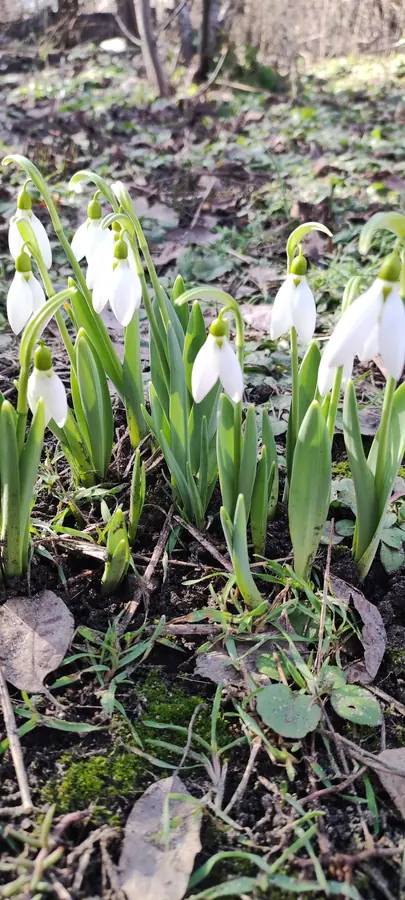
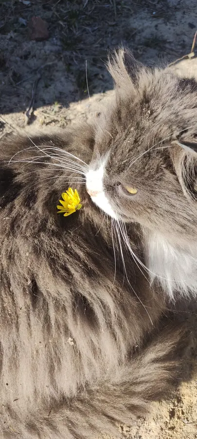
The archive, as it was sorted
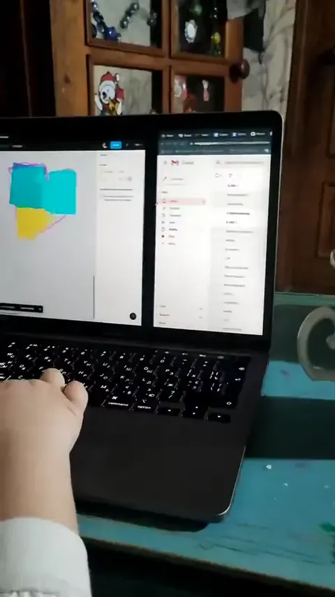
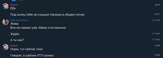
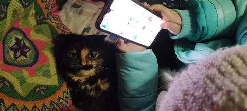
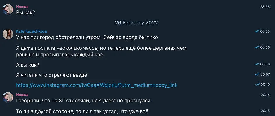
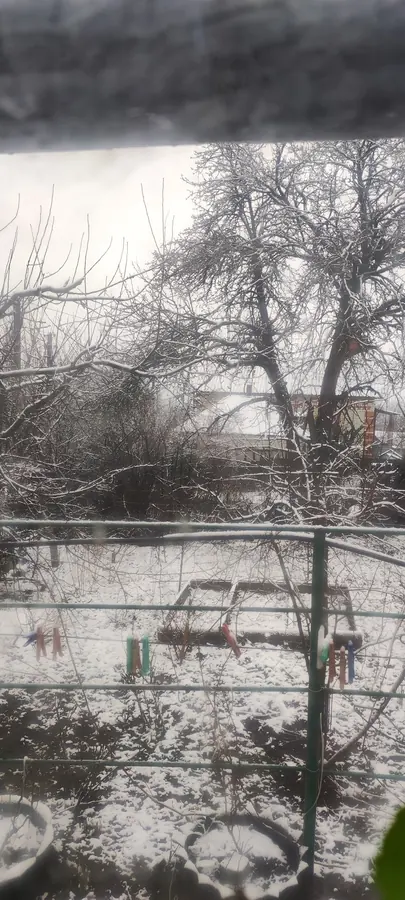
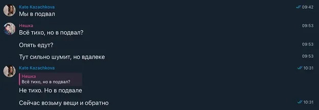
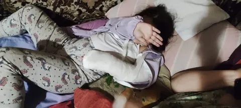
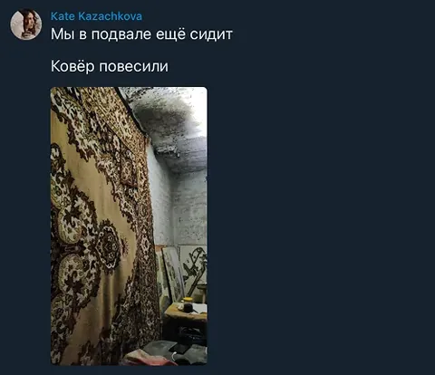

Finding the structure
My first instinct was to organise the story into chapters: occupation, survival, liberation, destruction. It made sense on paper. But it didn’t feel like what we had lived through. Those categories only made sense afterwards, knowing how the story ended. At the time, we didn’t know what the next day – or even the next hour – would bring.
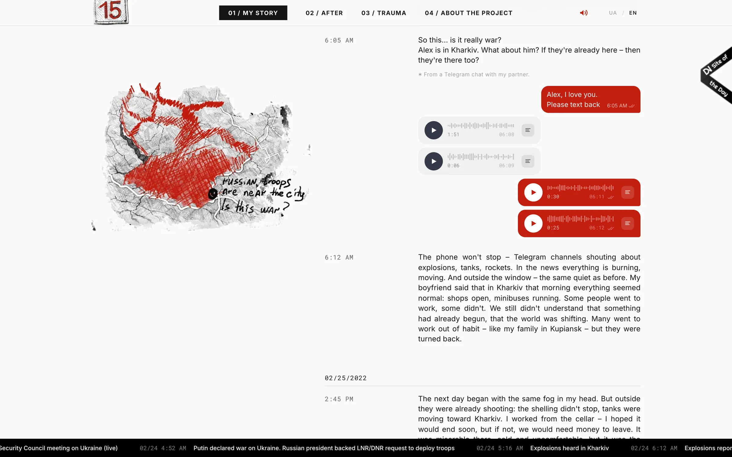
Then I went back to the messages: 05:00, 05:45, 06:05.
The structure was already there: time. Dates and timestamps became the information architecture. Instead of retrospective chapters, the visitor moves through events in the same order my family did.
That became a rule for the whole project.
Four decisions that shaped the experience
You have to open the door
I knew this story could be difficult for some people to experience. It includes war, occupation, loss, personal messages and sound.
So I didn’t want the story to simply start.
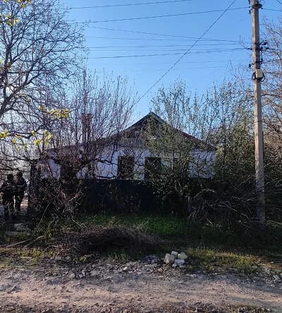
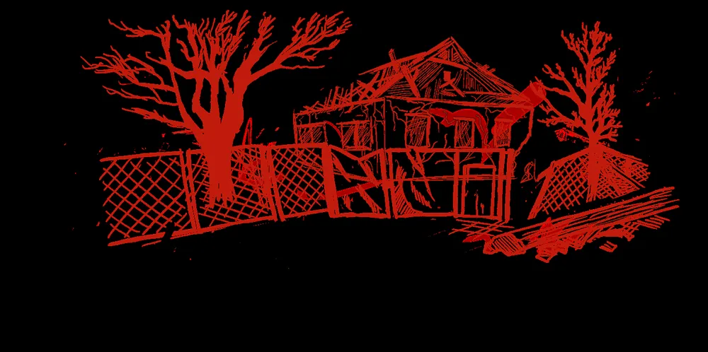
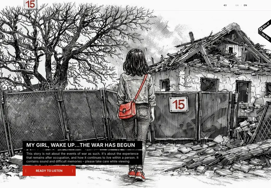
The first screen asks the visitor to make a conscious choice: open the door and enter. Only then does the experience – including sound – begin. The door became a natural boundary between the outside world and the story. It gives people a moment to decide whether they want to step inside. The cover itself started with a photograph of my family home. I explored several directions through sketches, then used AI to develop the final illustration from the original photo and selected concept.
Entering this story had to be a choice.
The story comes first
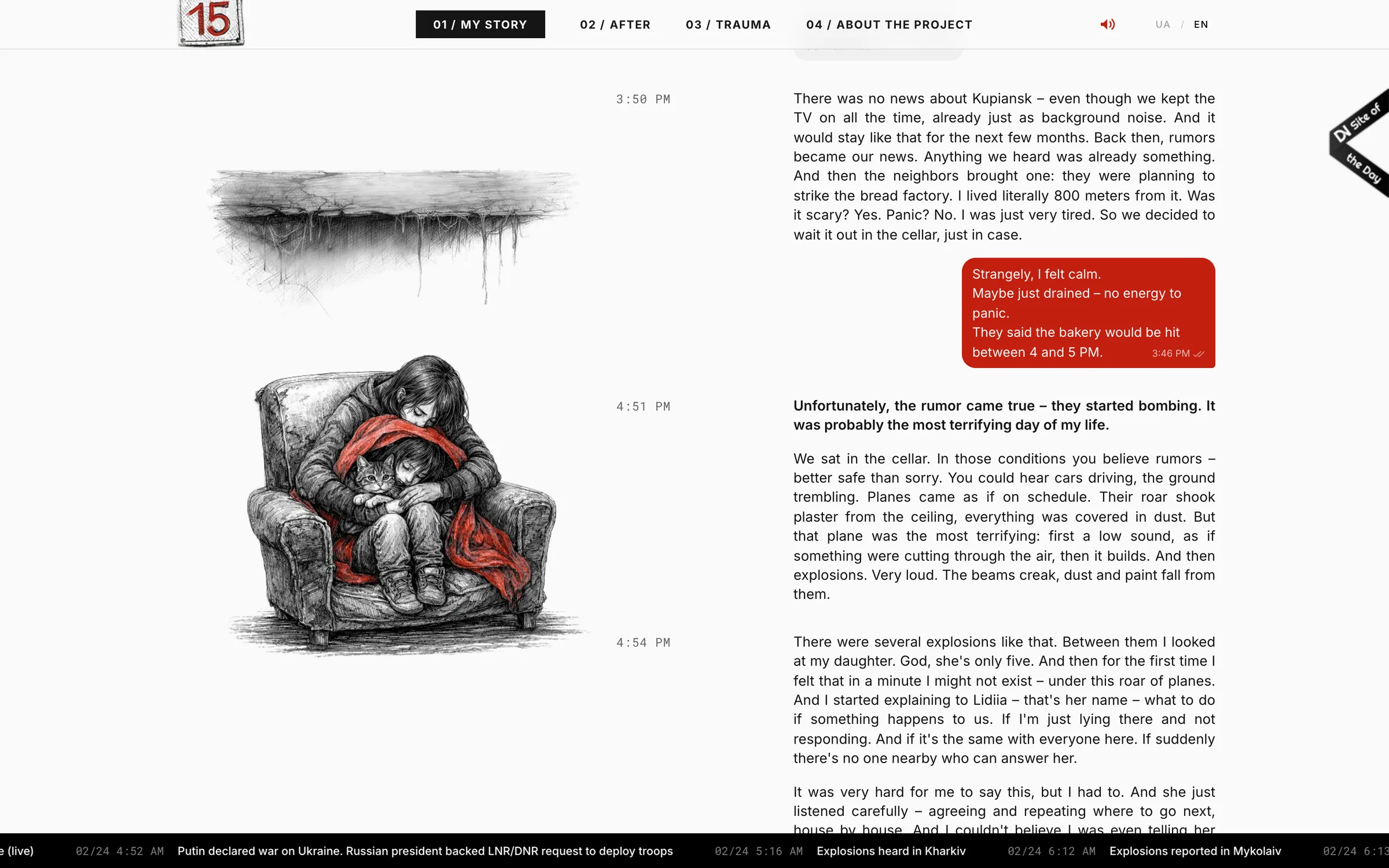
I didn’t want people to pay much attention to the interface. The story had to stay at the centre. It unfolds through time – dates, timestamps, messages, photographs and voice notes appear in the order they happened. There are no chapters to choose from or menus telling you where to go next.
I added illustrations and a map where they helped give context, but never as decoration. When location matters, the map supports the story. When it doesn’t, it disappears.
The UI was designed to do the same: guide the visitor when needed, then step back.
One colour, one meaning
I kept the experience almost entirely black and white. It felt right for the archive and left the focus on the story rather than the visuals. Red is the only exception. I chose it because this is an emotional story – about danger, loss, memory and home. I used it sparingly, so when it appears, it carries weight without overwhelming the content.
The number 15 became the main visual symbol of the project, taken from the enamel plate on our house. The real plate is still hanging on the gate.
Editing was part of the design
The archive contains much more than the website does. Some messages repeated what was already clear. Some photographs were too personal to share. And some details simply didn’t help move the story forward.
Choosing what to leave out was one of the hardest parts. I kept coming back to one question:
Does someone need this to understand what happens next?
If not, it probably didn’t need to be there. Showing everything wouldn’t have made the story more honest. It would have made it harder to follow. The goal wasn’t to preserve every piece of the archive. It was to preserve the story.
Designing the emotional pace
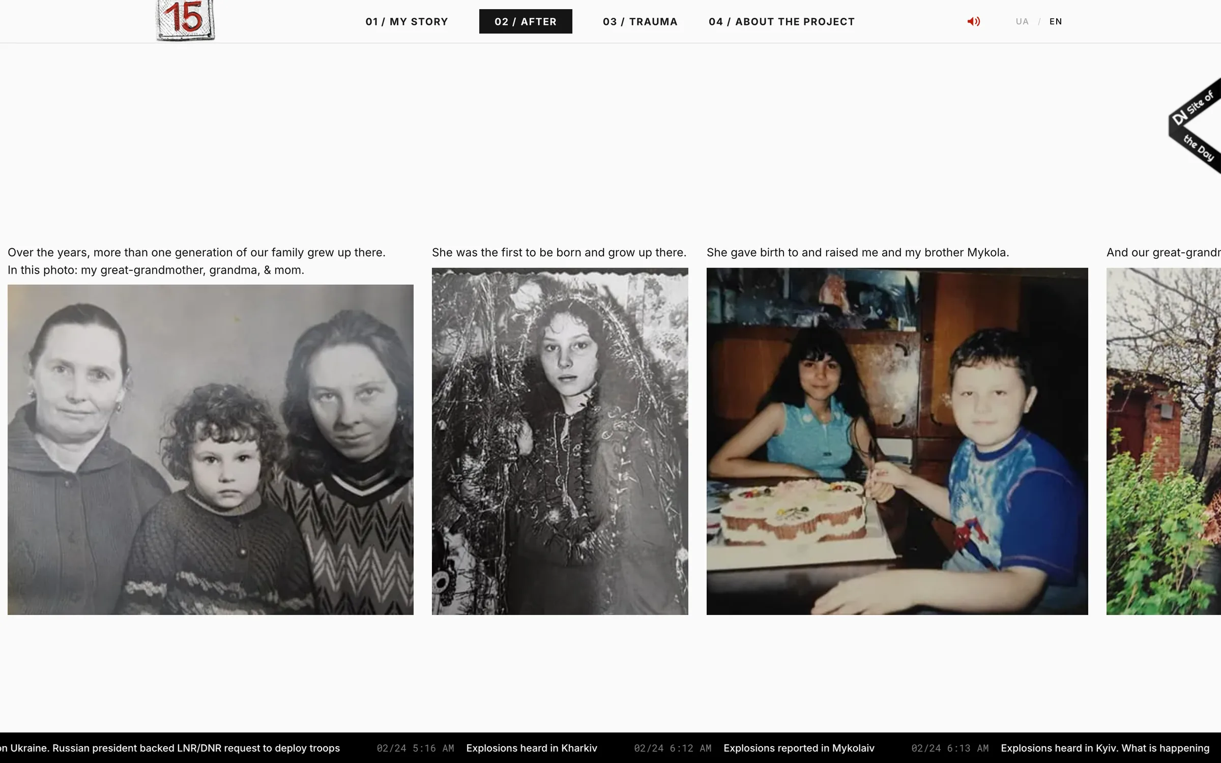
The story is emotionally heavy on its own, so I didn’t want the interface to exaggerate it. Instead, I used pacing to guide attention. Messages appear one by one. Photographs interrupt conversations. Voice notes make you stop reading and listen. Sound effects add atmosphere without telling you what to feel.
Some moments move quickly. Others slow down and leave space before the story continues. I treated motion, sound and pauses as part of the storytelling – not as effects added on top of it.
The goal was to create space for the material, not make it more dramatic.
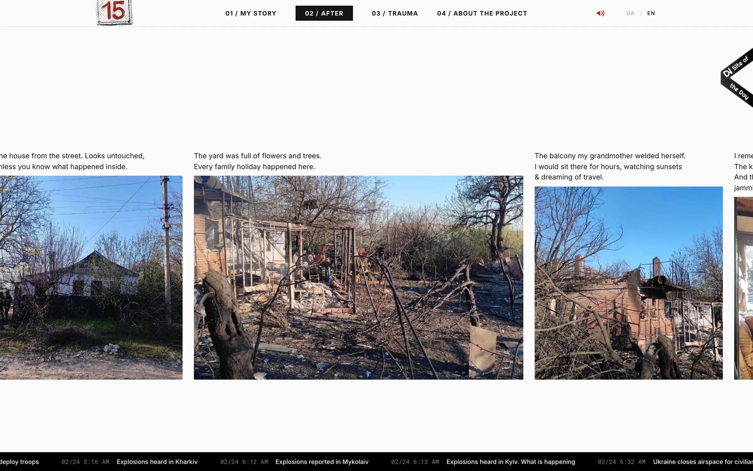
Beyond Figma
Ukrainska 15 started in Figma, but I quickly realised that static screens weren’t enough. Timing, transitions, sound and pacing only really work when you experience them. So I designed and built the site myself, pair-coding the front end with AI.
HTML · CSS · JavaScript · GSAP · ScrollTrigger · Netlify
The outcome
I made Ukrainska 15 independently – without a client, a team or an existing brief. The project received international recognition across UX, UI, innovation and digital storytelling, including two MUSE Gold awards and four CSS Design Awards, and was featured in international media and design publications.
What mattered most to me was that something so personal could resonate with people who had never met my family or seen this house.
A private family story had found an audience far beyond us.
What I would do differently
I launched Ukrainska 15 without analytics. At the time, tracking such a personal story felt wrong. Looking back, privacy-first analytics could have answered one important question: Did people reach the end?
If I built it today, I would measure completion and drop-off – not to optimise for clicks, but to understand how people experienced the story.
What the project changed for me
This project taught me that sometimes design is as much about what you leave out as what you add. But personally, it gave me something more important. For a long time, preserving the house and preserving the memory of it felt like the same thing. They aren’t. The house is gone. The messages, voices, photographs and stories are not.
Ukrainska 15 didn’t bring my home back. But it helped me finally let it go.